Turning Complex Data into Clear Actionable Visuals with
Intuitive Data Driven Dashboards
Enterprise UX
B2B Saas
Data visualization
At HCL Technologies, I designed multiple enterprise-level Power BI dashboards and reports rooted in design thinking and agile methodologies, these solutions were crafted to reduce cognitive load, empower users, and drive meaningful business outcomes through thoughtful, user-centered design.
While the projects remain confidential under NDA, this case study illustrates my end-to-end design process, highlighting how I combine UX principles, data storytelling, and interactive UI design to transform complex data into intuitive, actionable insights.
Context
Microsoft Partner Ecosystem platform serves as a centralized hub for tracking partner relationships, program participation, events, performance metrics, and overall business growth, supporting internal teams in managing strategic partnerships and driving informed decisions.
Problem
The platform's overwhelming data layout and poor navigation hindered users from efficiently accessing partner insights, increasing cognitive load and slowing productivity.
Solution
Redesigned the interface using Power BI and Microsoft's design system to streamline workflows, visualize key metrics, and simplify decision-making through intuitive, user-centered interactions.
Tools
• Figma
• Excel
• PPT
• PowerBi
Team
• UX Designer
• Developers
• Project Managers
• Stakeholders Excel
Role
• Stakeholder Interviews
• Data analysis
• User Flow
• Data Visualization
• User Interactions
• Rapid Prototyping
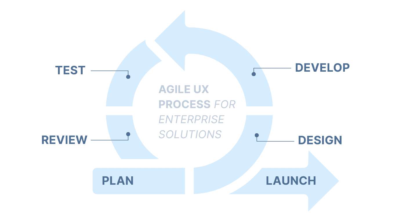
Design Process
There’s no fixed design process that applies to every project or team. Here’s the Agile UX design thinking approach I typically follow to adapt quickly to changing requirements, collaborate closely with cross-functional teams, and iteratively deliver user-centered solutions that align with business goals.
How Might We
Reduce cognitive load and improve task efficiency
to accelerate effective and strategic business decisions.
01
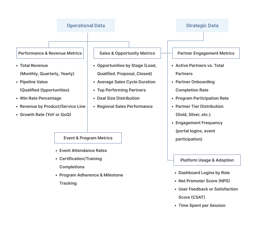
Assessment of Current Data
The first step is evaluating the data to uncover opportunities for optimizing workflows and guiding design decisions.
Reviewing existing spreadsheets, reports, and dashboards
Mapping how data flows across teams and departments
Identifying what constitutes high-level data versus operational/ supporting data
Understanding inconsistencies and redundancies in current data/processes
02
Stakeholder Interviews
To ensure the design is rooted in real user needs, I begin by conducting guided interviews with stakeholders.
I use a structured template with focused questions aimed at uncovering:
"It feels overwhelming. I often have to sift through multiple dashboards to find the data I need"
"I’m spending too much time figuring out where to look rather than using the information to make decisions."
"Navigating through the dashboard is time-consuming and I often overlook important data."
"It feels overwhelming. I often have to sift through multiple dashboards to find the data I need"
"I’m spending too much time figuring out where to look rather than using the information to make decisions."
"Navigating through the dashboard is time-consuming and I often overlook important data."
03
Defining Workflows
Information architecture is established based on the collected data, forming the foundation for intuitive dashboards aligned with business objectives.
Data workflows are created, ensuring the delivery of actionable insights to support decision-making at all levels.
The information is continuously iterated and refined through structured meetings with clients for each dashboard view.
Design of each view is informed by client feedback and iteration before finalizing the dashboard layout.
05
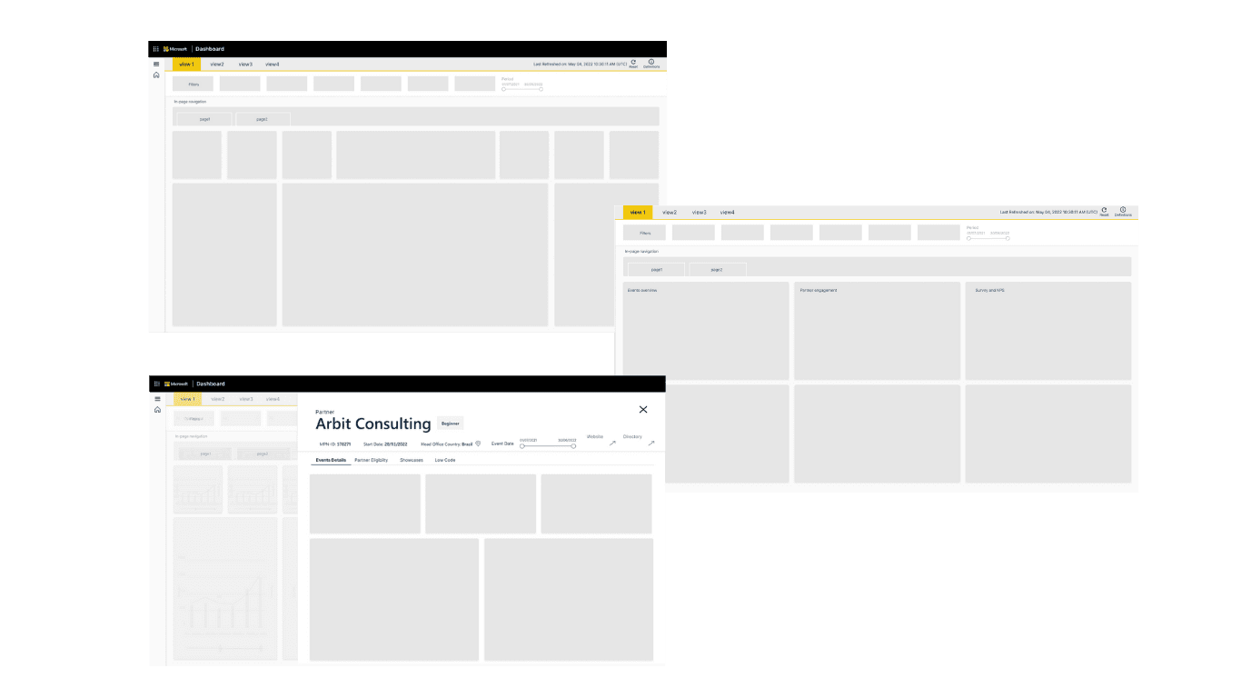
Wireframing
At this stage, wireframes are created to support the data and information architecture that acts as the blueprint for the product, allowing teams to explore structure, layout, and content hierarchy without the distraction of visual design. Each wireframe is built with a strong focus on clarity, consistency, and efficiency, ensuring that the design accommodates both high-level overviews and drill-down capabilities.
08
Color and Typography
Aa
Font Color: #092642
Microsoft Font
Segoe UI
Regular
Semibold
Bold
Regular
14px
14px
Button Font
Metric Title
Regular
32px
30px
Line Height
Font Size
Font Weight
Section Title
Semi bold
24px
20 px
Tile Title
Sub Metrics
Metrics Context
Metrics Value
Tile Heading
Tile Metric
Regular
Regular
Semibold
Regular
Regular
12px
Semibold
12px
20px
14px
12px
14px
12px
18px
12px
20px
12px
18px
07
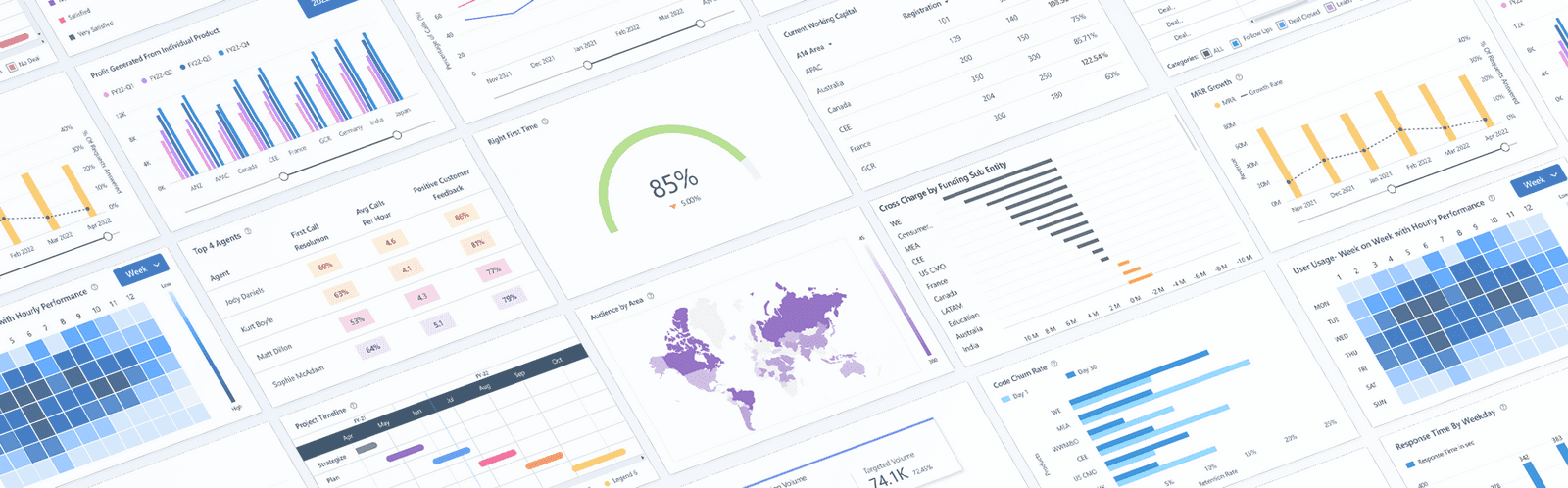
Data Visualisations
Once the layout and structure are finalized, the next step is to bring the data to life through purposeful and intuitive visualizations.
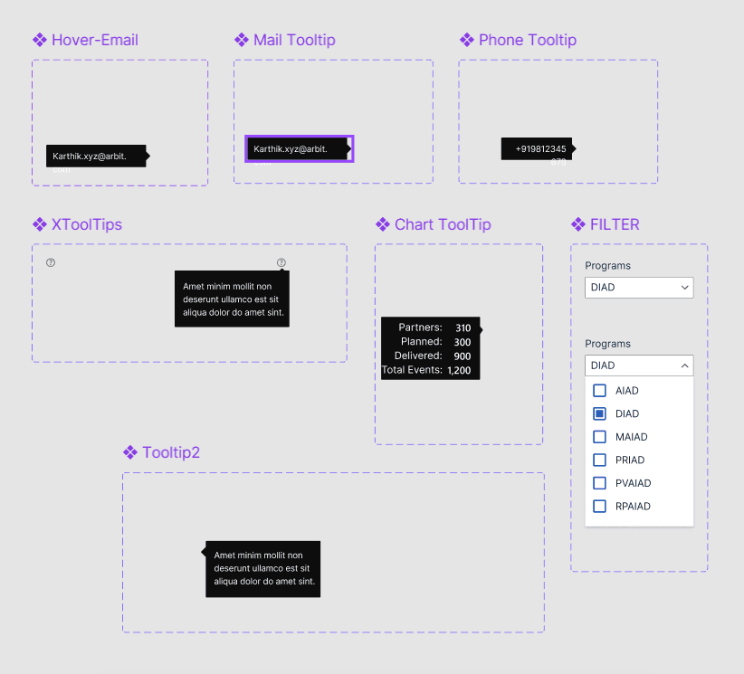
Data visualization cards are designed to highlight key metrics and trends at a glance. These modular components serve as the building blocks of the dashboard, enabling users to quickly scan, compare, and interpret insights without diving into raw data.
Each card is crafted to match the data type and user intent—whether it’s a line chart for trends over time, bar charts for comparison, pie charts for distribution, or tables for detailed breakdowns.
Visualizations are designed with clarity, minimalism, and hierarchy in mind—emphasizing the “so what” behind the numbers. Tooltips, filters, and drill-down options are added to support deeper exploration when needed, without overwhelming the primary view.
Cards are responsive and reusable, allowing for consistency across different dashboard views and scalability across future updates.

Customizable interactive charts allowed users to personalize their data views over time, resulting in a more tailored and relevant user experience.
Try this interactive prototype!
05
Design-to-Dev Handoff
Dashboards are built using reusable UI components to maintain consistency and support scalability across modules and views.
All components, specs, assets, and annotations are documented and shared with developers through tools like Figma to ensure clarity and consistency.
07
Delivering Impact
The MVP dashboard opened to high-level information, allowing users to quickly understand key metrics and trends with minimal navigation. Overall, the advancements led to a more engaging and user-friendly dashboard, improving user satisfaction and adoption rates.
Watch the video below to get an overview:
The bookmark navigation feature ensured a seamless transition between different dashboard views, maintaining consistency and enhancing the overall user experience.
Summary widgets and cards display key metrics, along with tooltips & annotations, providing clear and comprehensive insights, and enhancing overall data comprehension.
Customizable interactive charts allowed users to personalize their data views over time, resulting in a more tailored and relevant user experience.
The introduction of overlays accessible by quick links for accessing partner information minimized the need for context switching, thus streamlining workflows and reducing the time and effort needed to obtain relevant data.

Table view highlight


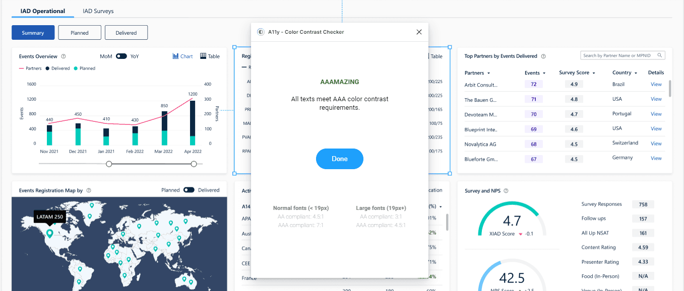
Above all, prioritized accessibility by meticulously ensuring that every card and the entire dashboard were designed to be fully inclusive. Figma's built-in accessibility checker and A11y contrast checker guaranteed compliance and an inclusive experience for all users.
vbvmn XZN SKC asc
Efficient Data Analysis: Intricate data tables were simplified, allowing users to quickly identify and analyze essential information, improving the efficiency of data categorization and partner engagement analysis.
Above all, prioritized accessibility by meticulously ensuring that every card and the entire dashboard were designed to be fully inclusive. Figma's built-in accessibility checker and A11y contrast checker guaranteed compliance and an inclusive experience for all users.
The scroll ends here, but the story doesn't have to.
Get in Touch